
Chris Eigner and Ildikó Tóth
eignerchris@gmail.com and ildiko@ildikototh.com
Application Name
Clatter
Description
Clatter (Class + Chatter) is a course-specific, web-based, mobile-friendly chat tool for student/teacher collaboration.
Device
The device for which we’re building the control model is a modern smartphone.
Control Model
User Feedback
The user liked the group functionality but was confused about how to target a single group or person when sending a message. We didn’t build controls for specifying this and so this will need some revising.
The user liked the long-tap to tag. He said this was an elegant way to keep tagging out of the way yet still easily accessible.
He suggested course setup should be done automatically through the school. We’ve long assumed automatic course setup was possible but hadn’t counted on implementing it. This bit of feedback was quite insightful.
The user also liked that uploaded material would be linked and downloadable with a single tap/click.
The user expressed some puzzling feedback regarding sending messages. He suggested that to avoid accidentally sending messages there might be a confirmation dialog. This isn’t behavior typically associated with chat clients but we’ll consider the feedback.
The user wasn’t particularly excited about notifications systems citing that he had enough things begging for his attention.
The user wasn’t sure if search was contextual to the current chat room or global. Our thinking was that it would be contextual and it sounds like we may need to call this out explicitly somehow.
The final piece of feedback from the user pertained to the size of the chat window on a smart phone. We’ll have to be sure to support a landscape view of the application to give users the option of rotating their phone for more chat real estate.
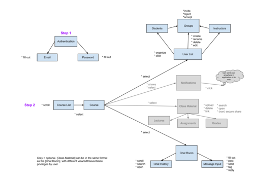
Content Model Differences
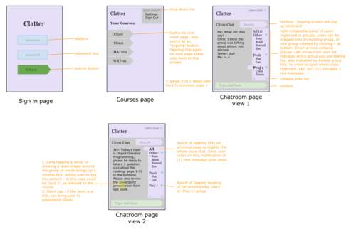
There were several implicit actions like scrolling, pressing “Enter” to send messages, and swiping that were not shown in the control model. Scrolling is expected of historical, threaded conversations. Removing the “Send” button was an attempt to increase screen real estate for the chat window. Swiping left/right to go to the prev and next screens was also an attempt to devote as much real estate to the chat experience and that navigational element was not present in the content model.
The organization of the four main “ideas” under the course: User, Notifications, Class Material, and Chat Room are less “separated” in the control model. The Chat interface provides a shell for the former three. It may be more clear to have tabs switching between these, but in efforts to have 80% of the content in the main chat page, the following implicit functions were used:
For displaying class material, we incorporate the use of tags and links to uploads in the chat window. The specific content can be filtered on by a “tag cloud” or the search, which we haven’t fully developed in the control model, as it would be an enhancement to the core function of the app.
In addition, the user list is used as a way to select the specific chat room the user wants to enter, which could also be described as a “conversation”. Each conversation would open the chat room to the person(s) who the user wants to talk to. The use of groups is ingrained in the chat room concept; tapping a group name opens a conversation with only those people in the group. Analogously, the user can open a chat room that has only 1 other person in it (aka a private message). Finally, the option of “All” opens the chat room to the entire class, as does a message in google groups to the whole group.
The above difference between the content and control model differs mostly in the concept of the relationship between the chatroom and the user list - in the content model, they appear completely separate, only connected by the class function, but in the control model, they are essentially the one concept, with the user list providing an “access definition” for each of the chat rooms. One limitation of this is that a user can only be in 2 groups at once - the “All” conversation (the word conversation replaceable by “group,” or “chat” in this context), and one other group which by default is “Other,” but could be in a user-defined group if set up that way by the user.Notifications are embedded as metadata next to the names in the user list as to be minimally intrusive to the user, but is one aspect that could be dropped, especially given the feedback above.
Scenario Differences
The control model covers all cases and UI interactions described in the scenarios. The control model differs from the scenarios in that the scenarios contained references to said implicit actions that we removed or optimized in the control model (i.e. extra steps like “submit”). Two of the following scenarios differ the most:
Group Assignment Case: This case differs in the steps taken. In the control model, since it is designed on a mobile platform, the way to add users to a new group is by dragging and dropping people into the group after it is created via the + sign, which is not what the original case described - it used a more traditional screen-to-screen wizard style.
Retrieving messages Case: Due to feedback from the user, the incorporation of notifications is no longer a separate section, but rather incorporated into the user list, or would be dropped entirely. The path to viewing messages is via the user list rather than by a notifications window.